Caraway: Minicart Redesign

MY ROLE: Digital Product Designer

Caraway Home is an online home goods retailer on a mission to craft well-designed, non-toxic cookware that thoughtfully raises the standards of what you cook with. For the minicart redesign I executed the user research, UI design, handoff to development, and optimizations post-launch working alongside the Project Manager, Lead Senior Designer, Growth and Development teams.

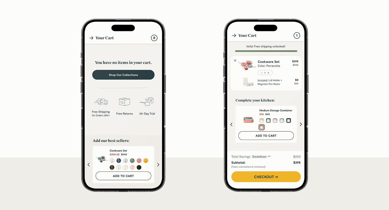
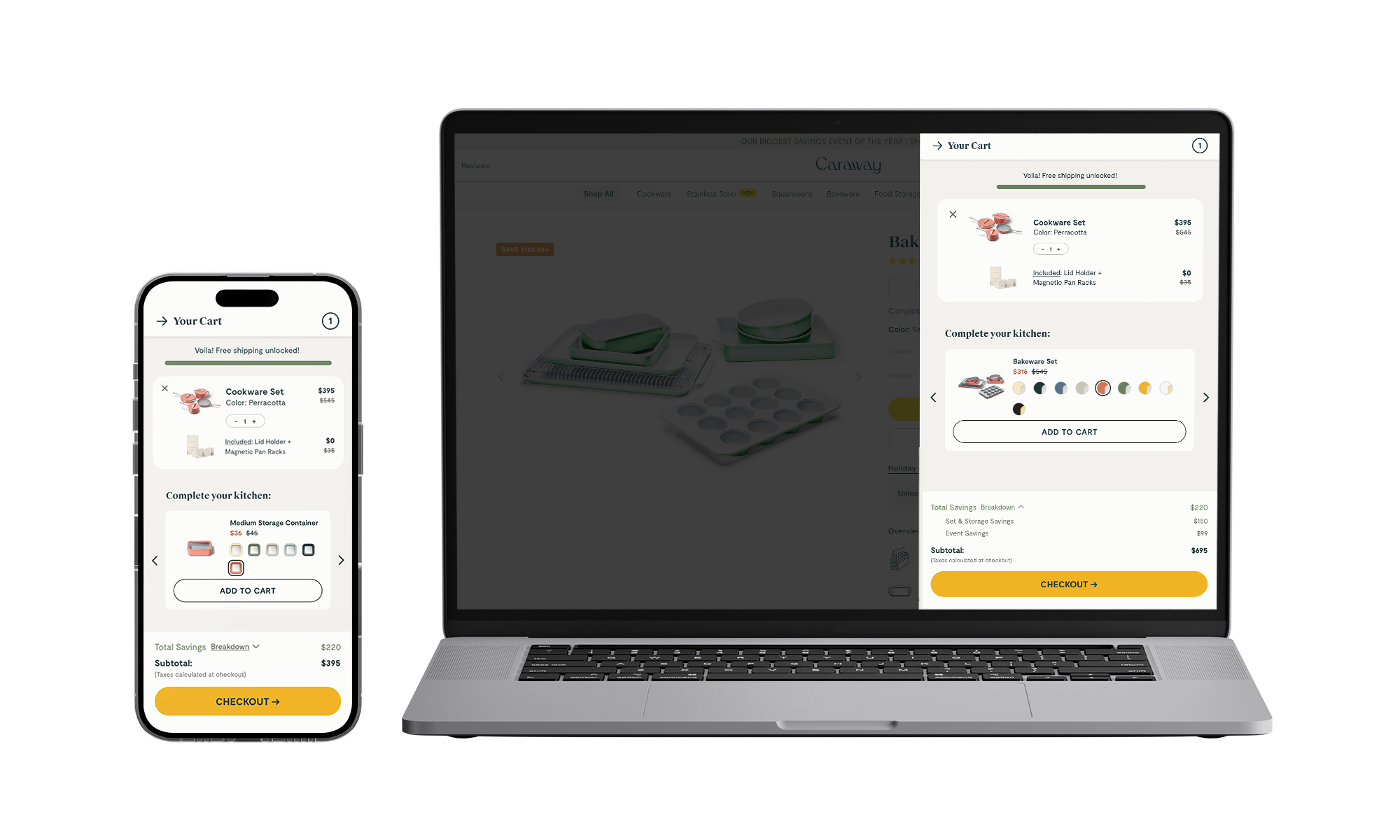
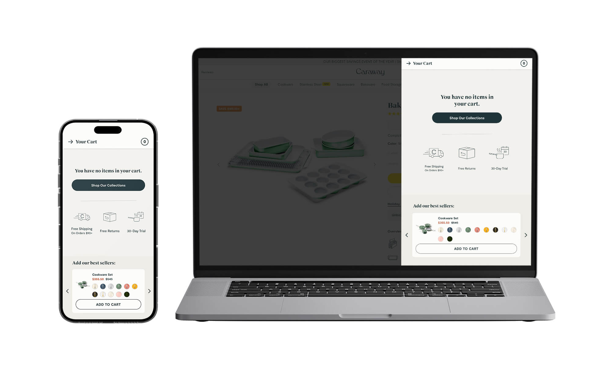
Final minicart redesign screens

Project Goals

How can we optimize the minicart to be more functional and increase conversion through the checkout funnel?

The strategy for this redesign was to create an optimized minicart that is easily accessible and all features are thoughtfully included to help a variety of customers at different points in their journey convert.

No items found.
This is some text inside of a div block.

User Research

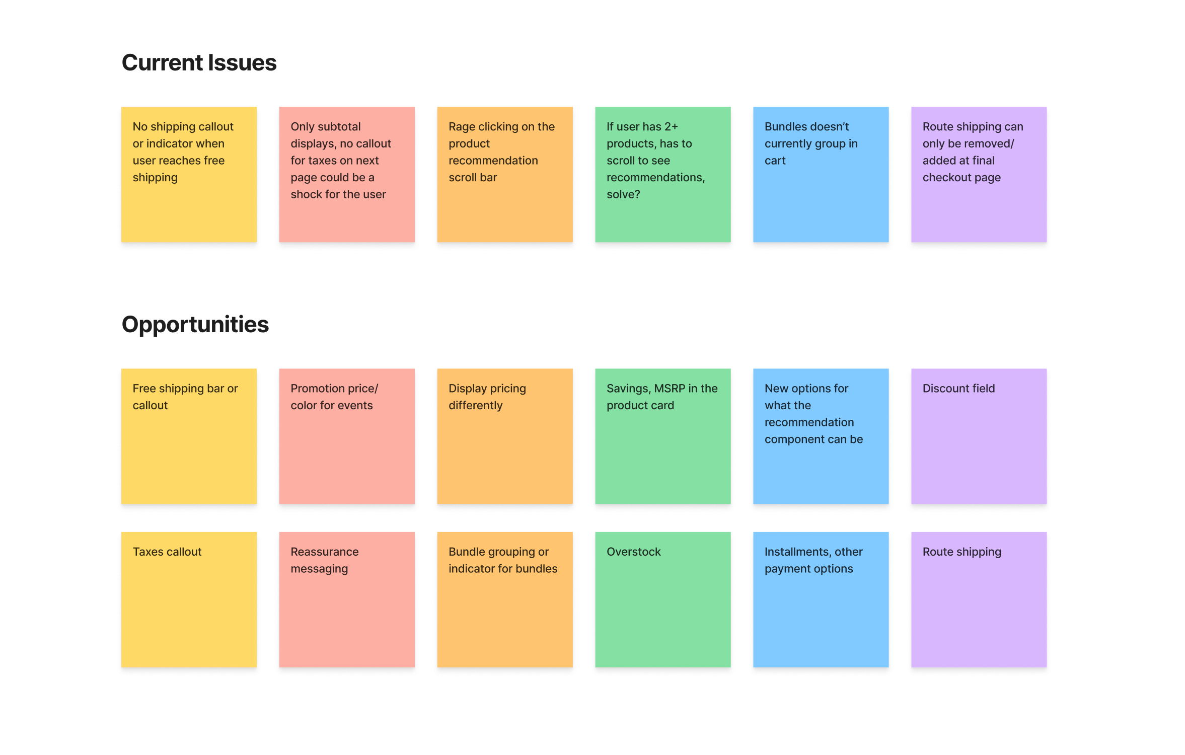
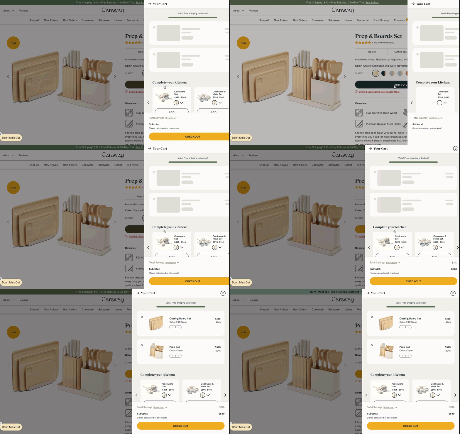
I utilized our user session recordings to watch how users interact with the existing minicart and expose where existing pain points lie. Also viewed past data to see any missing elements that can be key to get users to move towards the checkout funnel: upsell clicks, cart view clicks from empty state, mobile vs. desktop conversion rates, minicart views vs. number of those who proceed to checkout.

No items found.

Objectives

Main Objectives

Convert the user to the checkout funnel, use the upsell real estate thoughtfully, clearly show product pricing & sets, and show total savings and value messaging to resonate with customers.

KPIs

KPI Metrics include: Checkout CTA Clicks, CVR, RPS, and Upsell Engagement.

No items found.

Wireframes

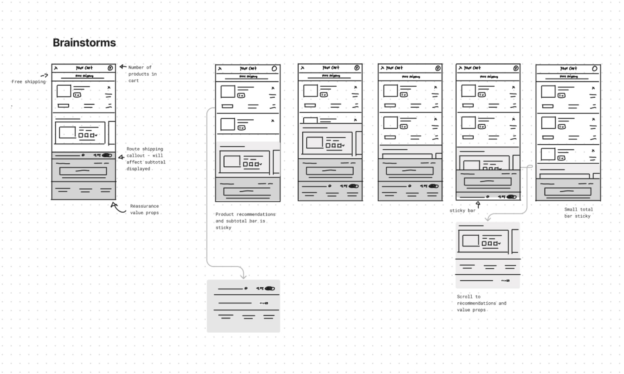
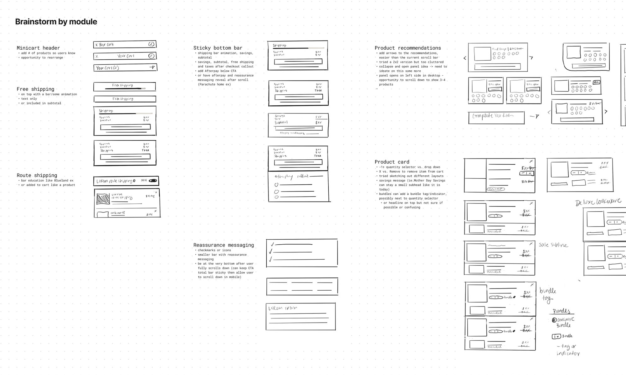
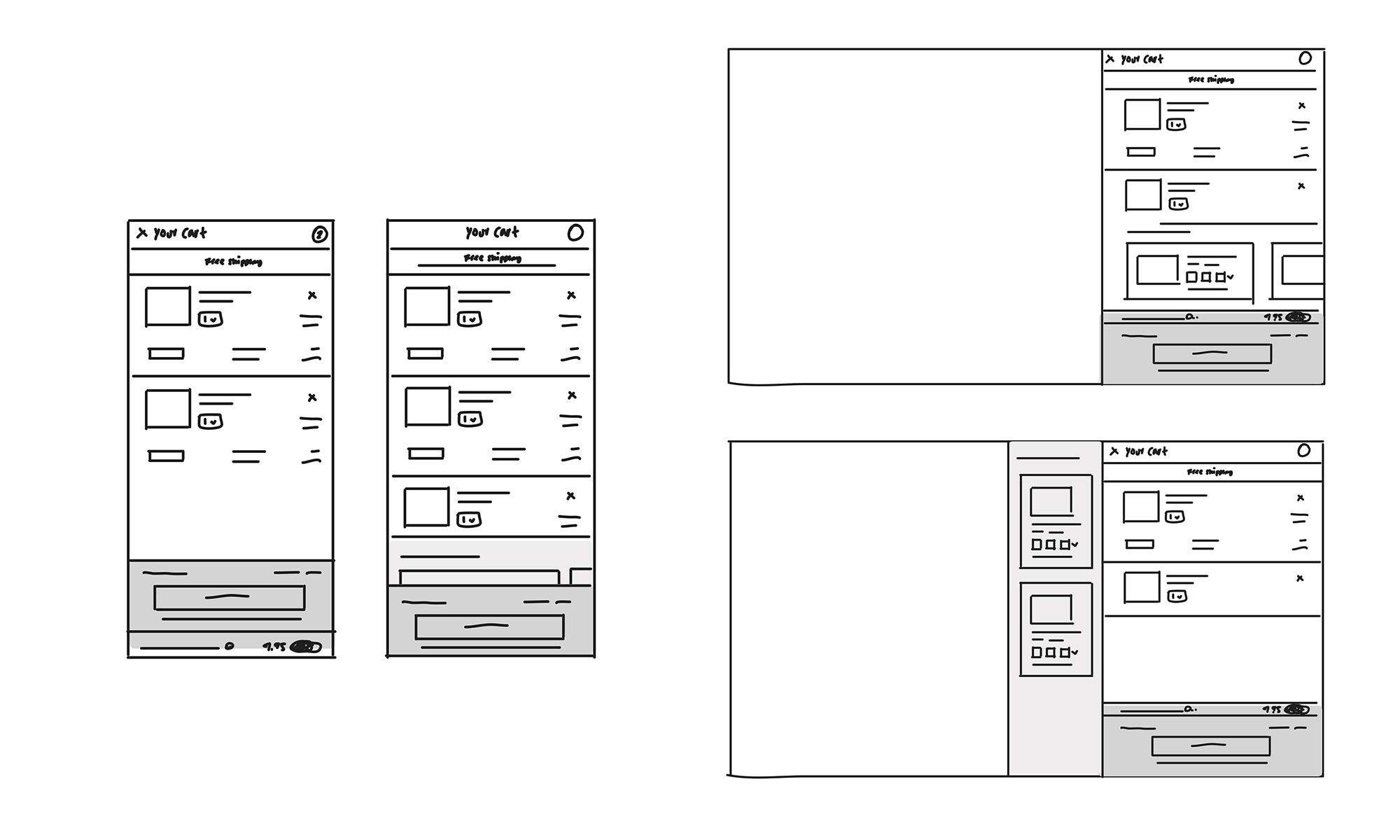
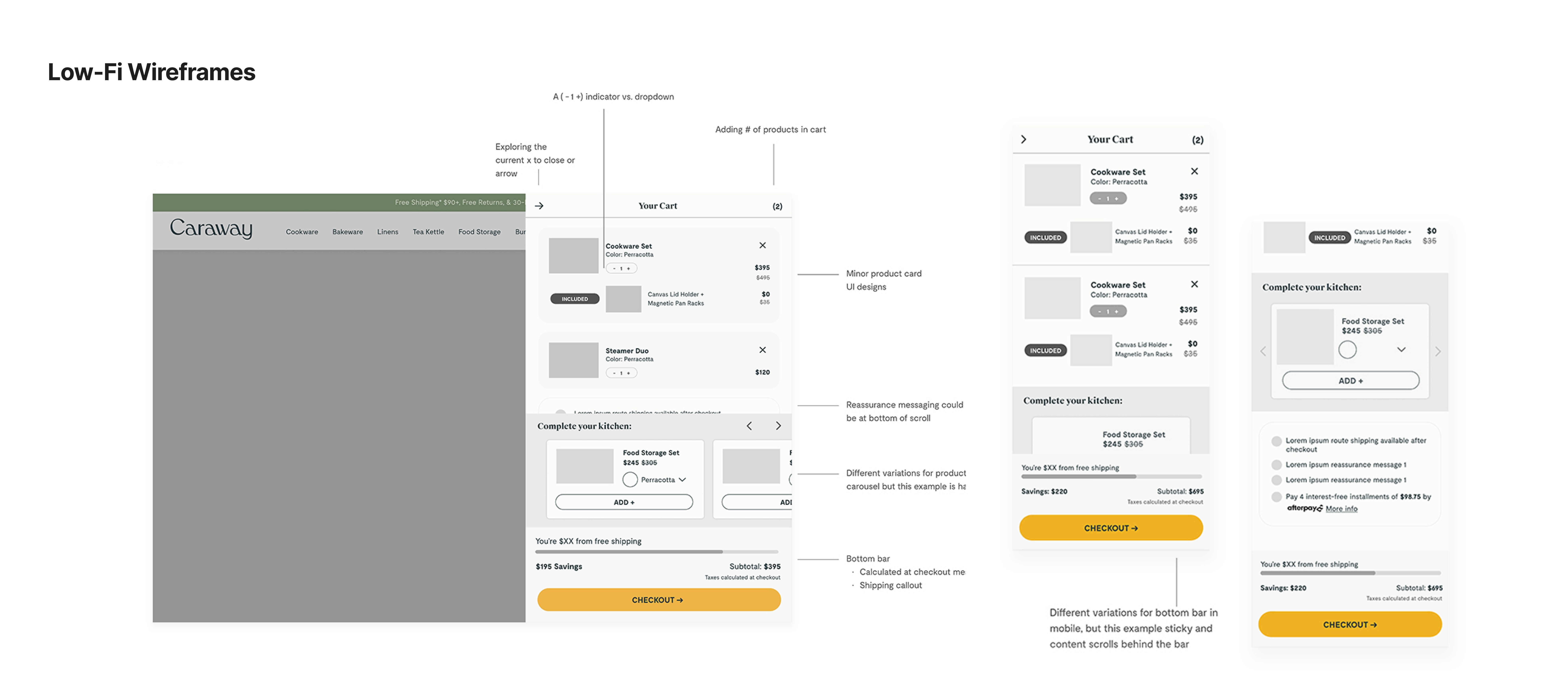
With objectives in mind, continuing the explorations with low-fi mocks to brainstorm each minicart section by each module. Then putting together low-fi wireframes for the first round of reviews with stakeholders.

No items found.

Phases

MVP: 

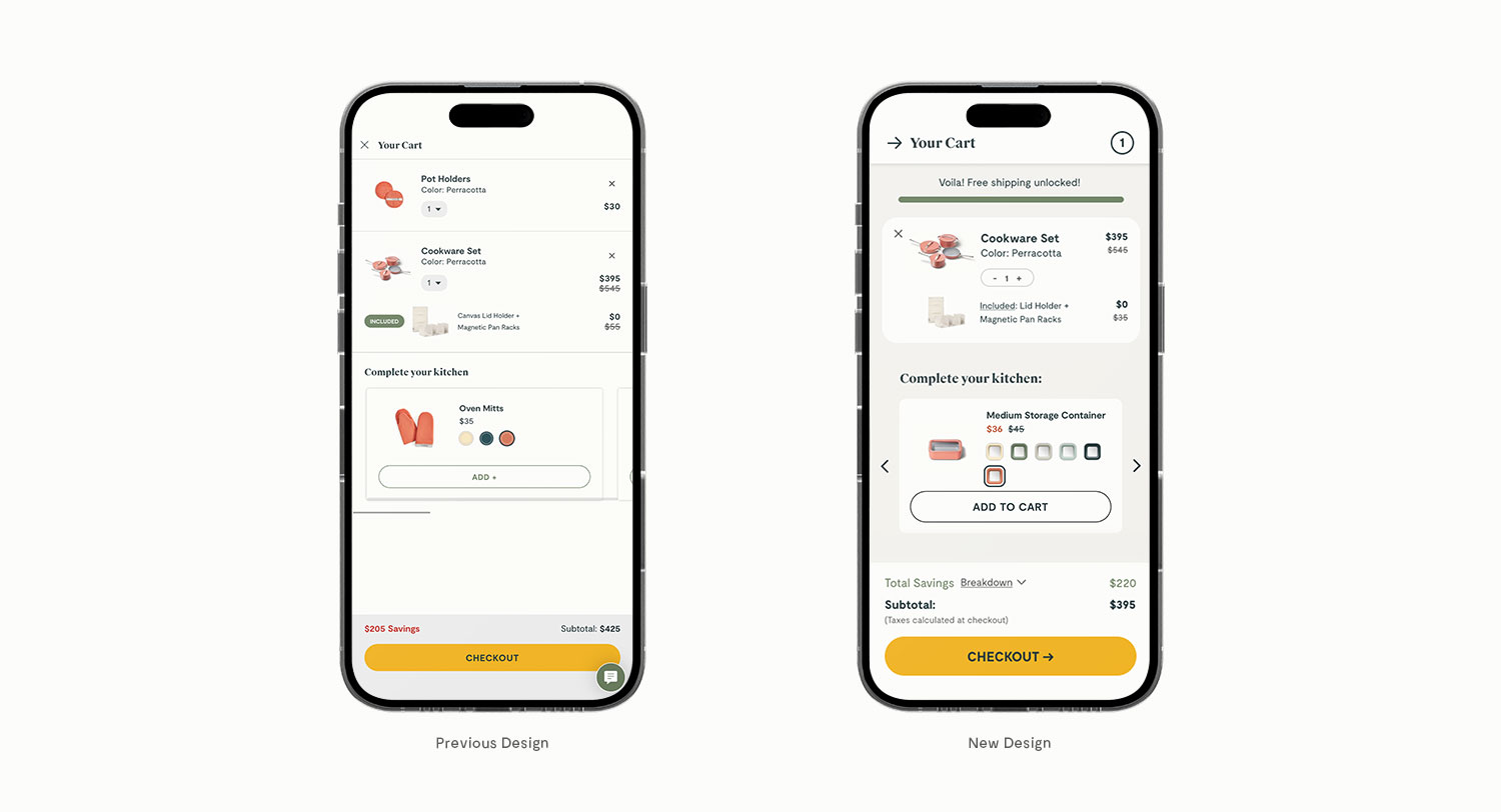
After rounds of reviews and finalizing the MVP design, the minicart redesign happened in four phases. A/B testing old design vs. new MVP design.

Phase 2: 

Optimizations and refinements, refined the breakdown section.

Phase 3: 

Testing for the summer event promotion, the breakdown section and new sales messaging. Also introducing the ability to change colors for the cart backgrounds for events.

Phase 4+:

Rolling out more optimizations and testing to be continued.

No items found.

Reflection

  • Users interacted with the breakdown section to see overall savings during the event.
  • Product carousel had a very slight decrease so looked into ways to test new layouts for the recommendation courses for Phase 4.
  • Overall I learned how to apply findings from user research and the importance of breaking down each new module with designs to fully get the extent of a redesign. This was a fun project working closely with my team members to execute!

No items found.
No items found.
No items found.
No items found.
Got a Project?
Let's Chat.
hello@ashgolladay.com